Diversified private education provider
Layered learnings
.jpg)
I was brought in as a freelance designer to support an agency tasked with rethinking the digital experience for a group of eight private education brands in South Africa. Each brand had its own identity, audience and priorities, but the ambition was singular: create a coherent, intuitive experience across the portfolio without flattening what made each brand distinct.
.jpg)
The challenge was less about redesigning websites and more about designing a system. One that could stretch across multiple brands, adapt to different contexts and scale over time, while still feeling considered and human at every touchpoint. We began with a brand that had recently refreshed its identity but whose website no longer reflected the needs of its audience. I started with a deep audit of the existing experience, interrogating structure, navigation and content flow to understand where friction lived and where clarity could be introduced. Best practice became a baseline rather than a destination, helping guide decisions around simplification and hierarchy.

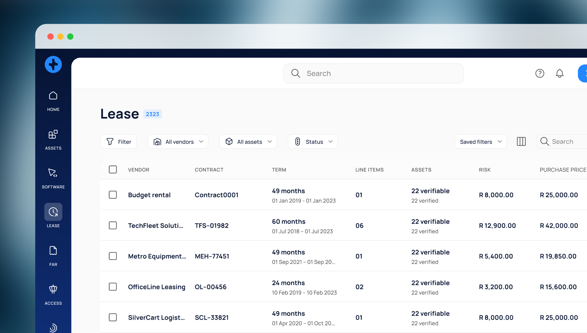
There was no user research or performance data to lean on. Instead, the work relied on pattern recognition, experience and a close reading of how the site asked people to move, decide and commit. From there, I mapped the end to end journey and translated it into a set of wireframes that defined key screens, flows and interactions.
Every decision was made with reuse in mind. The goal was not a one off solution but a flexible framework that could be adapted across the remaining brands. I explored interface just enough to test hierarchy, layout and interaction patterns, giving the agency a practical reference point for future rollouts without locking the system into a single visual expression.
.jpg)
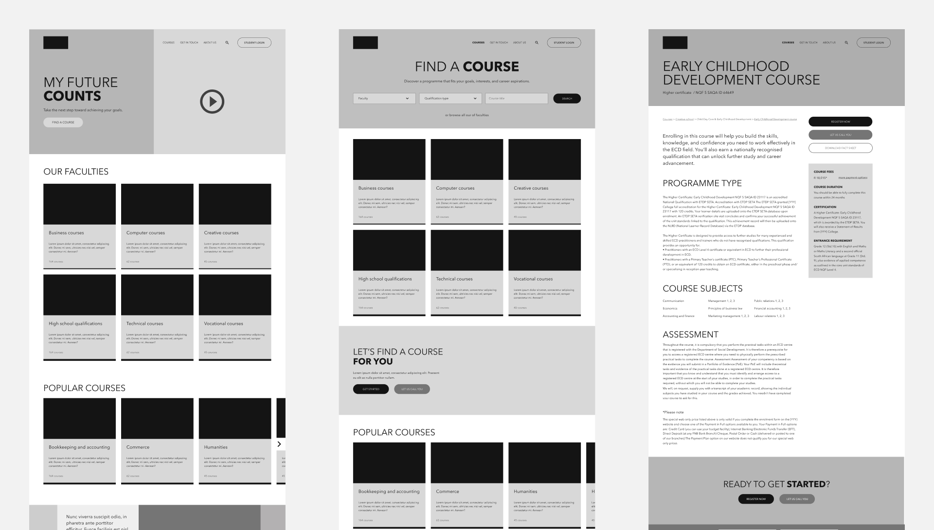
As priorities shifted, the project ultimately moved at a smaller scale than initially planned. Two brands received a full UX treatment and the first brand’s interface remained intentionally light. Even so, the work proved its value. The resulting journey maps, wireframes and design logic formed a blueprint for how a fragmented portfolio could operate under a unified UX approach. It demonstrated that coherence does not require sameness and that thoughtful system design can create clarity, cohesion and room to grow, even when applied selectively.
.jpg)
.jpg)