Continuon
Scaling with ambition
.jpg)
Continuon was a next-generation social-intelligence platform. It needed a brand refresh that reflected both its technical sophistication and its deeply human purpose. It wasn’t just about data; it was about meaningful relationships, relevance and resonance.
.jpg)
When I joined the team at Platinum Seed, Continuon had already done good work, but the identity had evolved in a loose, unstructured way. There was a logomark, a distinctive shade of orange, some early communication pieces — but across different applications the brand felt inconsistent, and it struggled to scale.

.jpg)
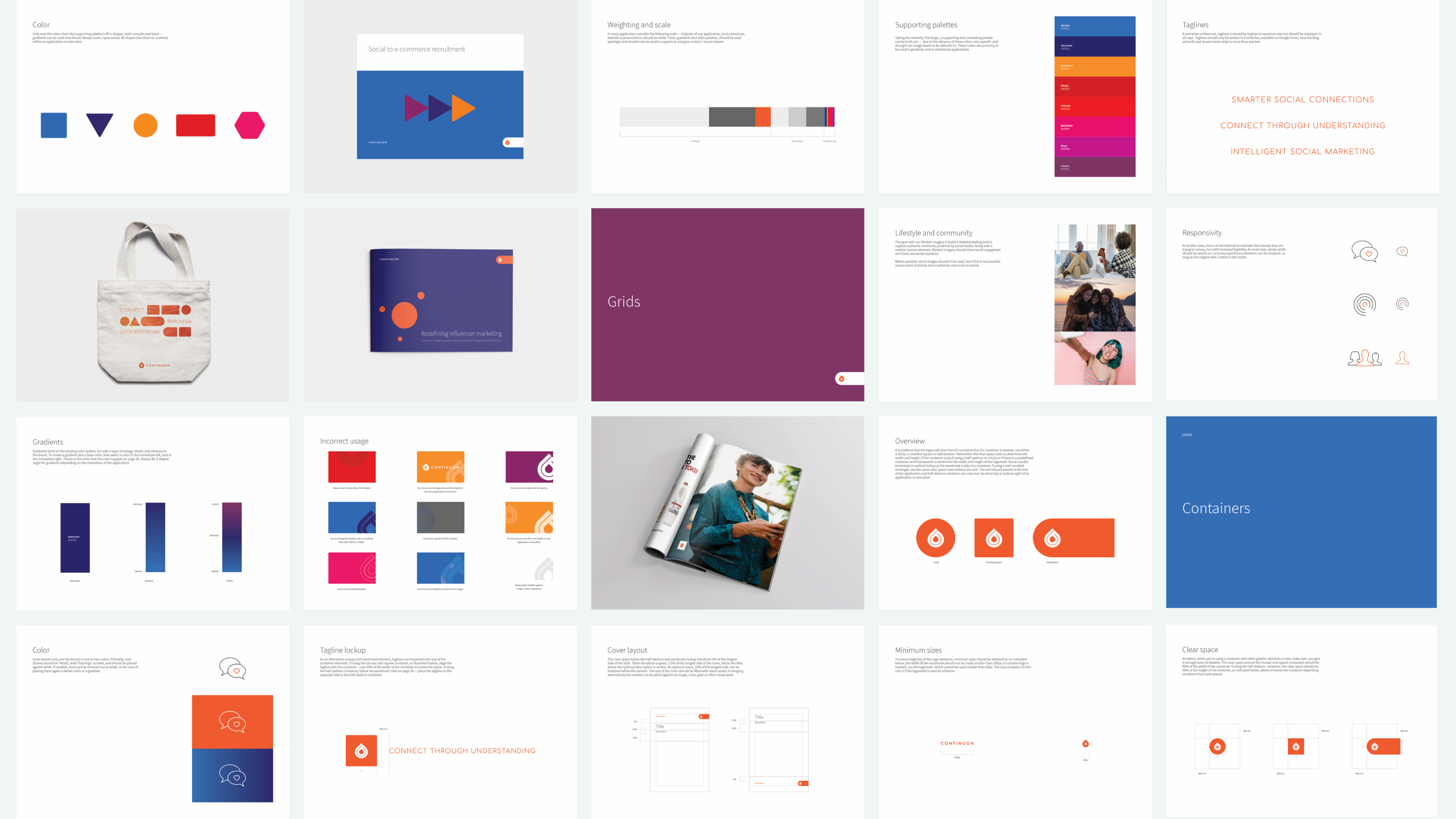
My mandate was to build the foundation for the next chapter. I started by developing a robust brand system. I refined and defined the rules for things like how the brand assets should be used in different contexts, established a clear typographic hierarchy, and clarified how shapes should work across all brand touchpoints.

I created expressive tools that gave the identity flexibility while keeping it coherent. The brand guidelines I built didn’t just capture where Continuon was — they provided a roadmap for where it could go.
.png)
Once that foundation was solid, I designed the marketing website as the first major showcase of the refreshed brand. Every part of the site aligned with the design system I defined. The result was a brand that felt confident and modular: it supported where Continuon was at that moment, and left room for where it might grow.
.jpg)
In the end I took fragmented brand assets and transformed them into a coherent identity. The brand shifted from being isolated to grounded, and the company’s message moved from incidental to intentional. Continuon was now able to present itself with clarity and composure as a platform that used machine learning to surface social and behavioural insights — helping clients create thoughtful, human-centred communication.

.jpg)
.jpg)
.jpg)