
An insurance challenger
A new kind of simple
.jpg)
Insurance is messy. I came into a project where the design system had already been migrated from another platform, cobbled together by different designers over time, but never really standardised. Components were inconsistent, accessibility was spotty, and tiny issues at the atomic level rippled outward until the whole experience felt fractured for everyone — users and designers alike.
.jpg)
I started with a full audit. I mapped out every component, every state, every gap. I logged missing states, contrast problems, inconsistent behaviours, redundant patterns. That audit didn’t feel glamorous but it laid bare exactly how the cracks had formed. It showed where small inconsistencies had chained together to create a fragmented user journey.
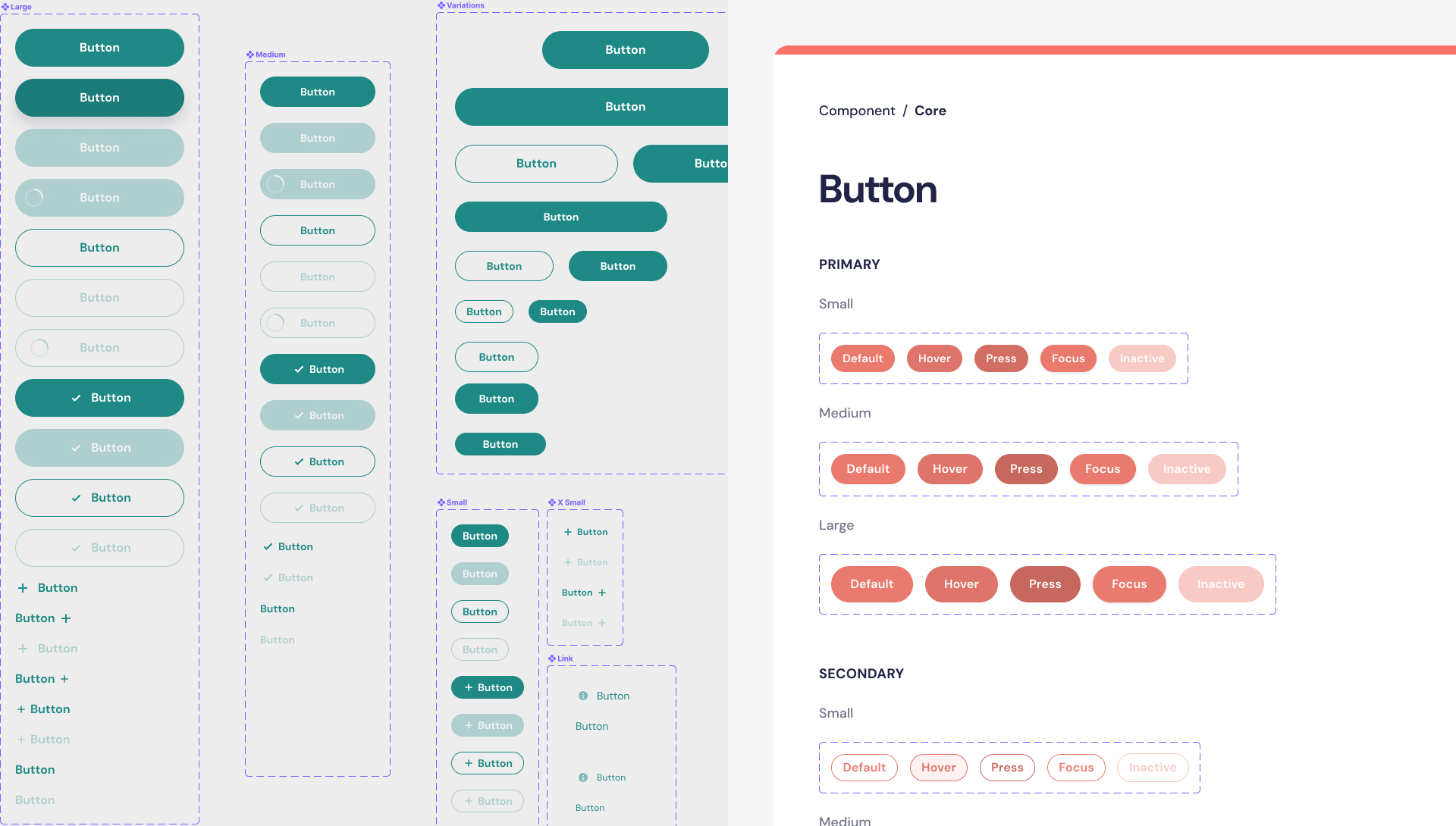

With that clarity I rebuilt the system from the ground up. I re-aligned components to a consistent logic, standardised interactions, embedded accessibility at every layer. I documented everything — so future work wouldn’t regress into chaos again. What emerged was a more disciplined, more predictable foundation. Designers could work within a shared language. Users got interactions that felt stable, intuitive, reliable.
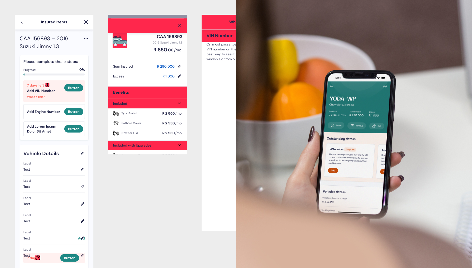
But I didn’t stop there. While the system was being restructured I dove into legacy design epics and features. I added support for tablet viewports, cleaned up user flows, smoothed out rough edges. I applied the new system principles in real context — testing how components played together across real pages. Every incremental improvement made the site easier to use and the work easier to maintain.
.jpg)
In the end the new system gave the brand a clean, strong backbone — a scalable UX infrastructure that could grow with future features and remain coherent. It was never about flashy visuals; it was about building something that worked, that held together, that functioned under pressure. And in doing that I turned a fractured, inconsistent design mass into a living system with flow, consistency and future-proofing.
.jpg)
Alongside rebuilding the system itself, I also worked on legacy design epics and features, introducing tablet as a supported viewport and generally improving the UX across existing flows and pages. This meant applying the new system principles in real context, testing how components worked together, and making incremental improvements that benefited both users and the wider team while the foundations were being rebuilt and standardized
.jpg)
.jpg)
.jpg)